

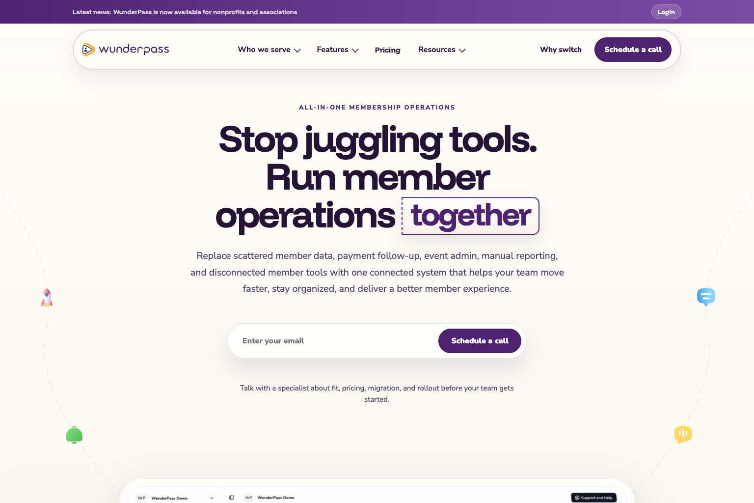
Serious software for people who don’t want to think about software.
WunderPass runs memberships, events, payments, messaging, and reporting in one place. The people choosing it run associations, nonprofits, chambers, clubs, and congregations, and they are busy with members, not software. Membership tools often feel heavy and dated, so the site had to prove WunderPass could replace a whole stack of tools while feeling like the easiest decision on the team’s list.
A welcome, not a sales pitch.
We explored a range of brand concepts before settling on the direction that felt most like WunderPass: warm, capable, and a little playful. A soft cream canvas and deep plum purple carry the confidence; sunny yellow and small 3D icons, like a rocket, chat bubbles, and a bell, add the friendliness. Rounded shapes and a boxed “together” in the headline signal that this is software built around people working side by side.
Let the product make the argument.
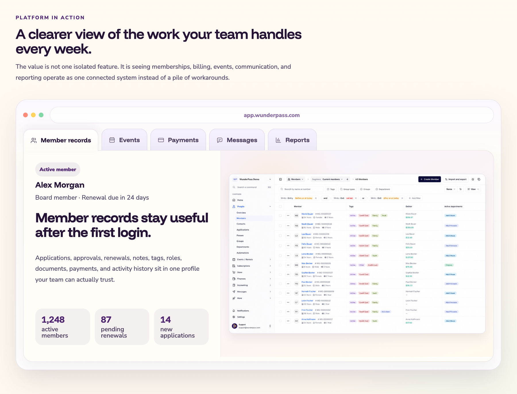
Instead of a wall of feature bullets, the site opens the product itself. Visitors move between member records, events, payments, messages, and reports in a live preview of the app, seeing the details their team handles every week rather than reading about them.
Every kind of organization should see itself.
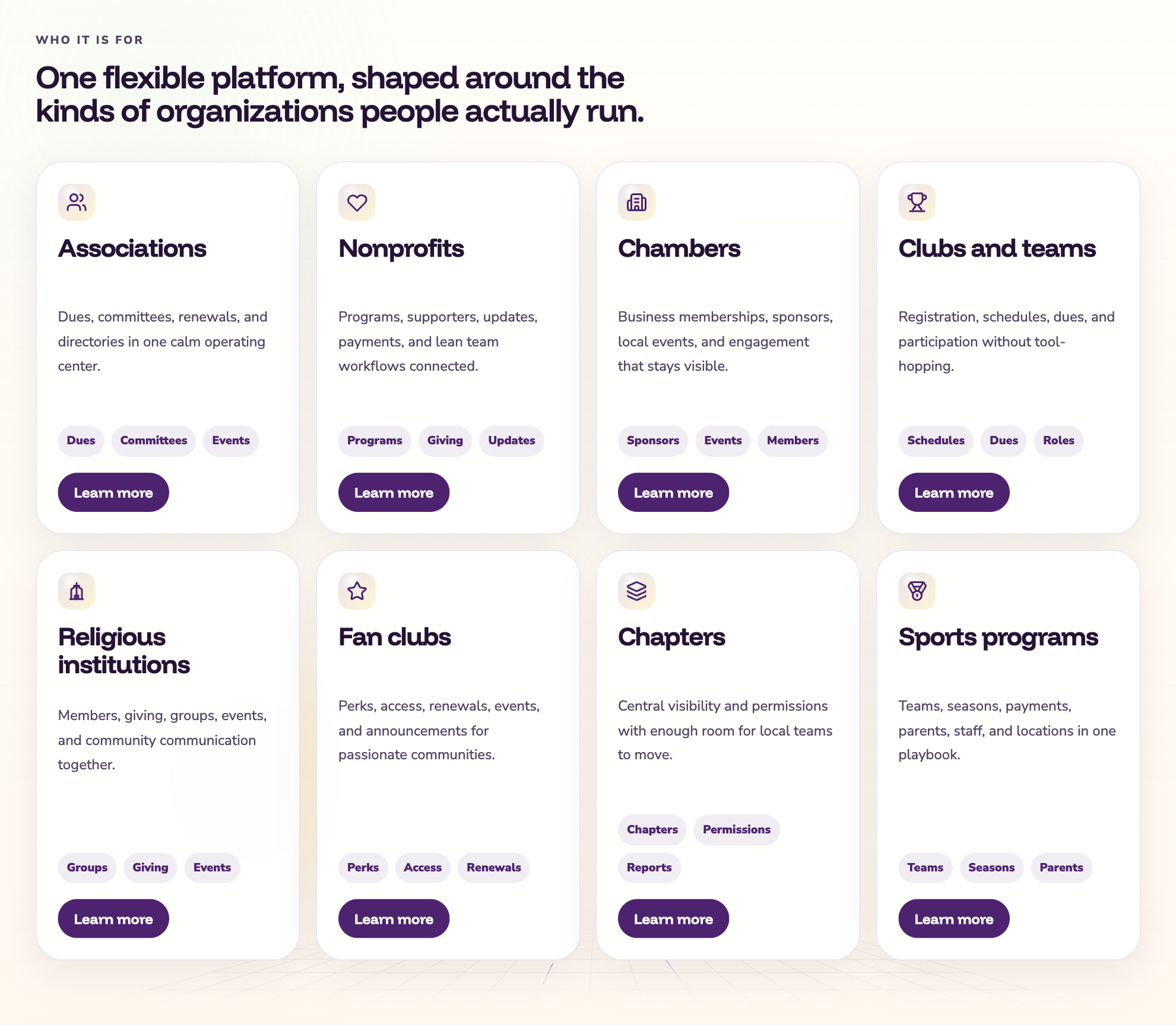
A membership director at a chamber and a coach running a youth league want very different things. Eight organization types each get a card in their own language, from dues and committees to seasons and parents, and lead to a dedicated page for that audience.
One member action, every team caught up.
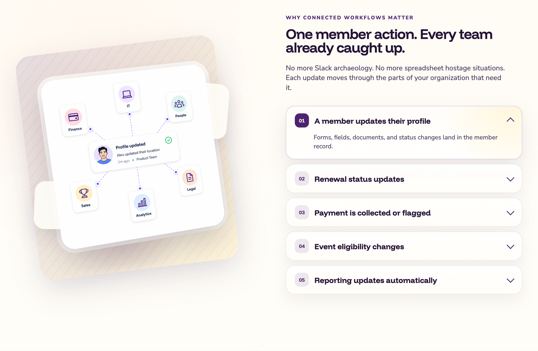
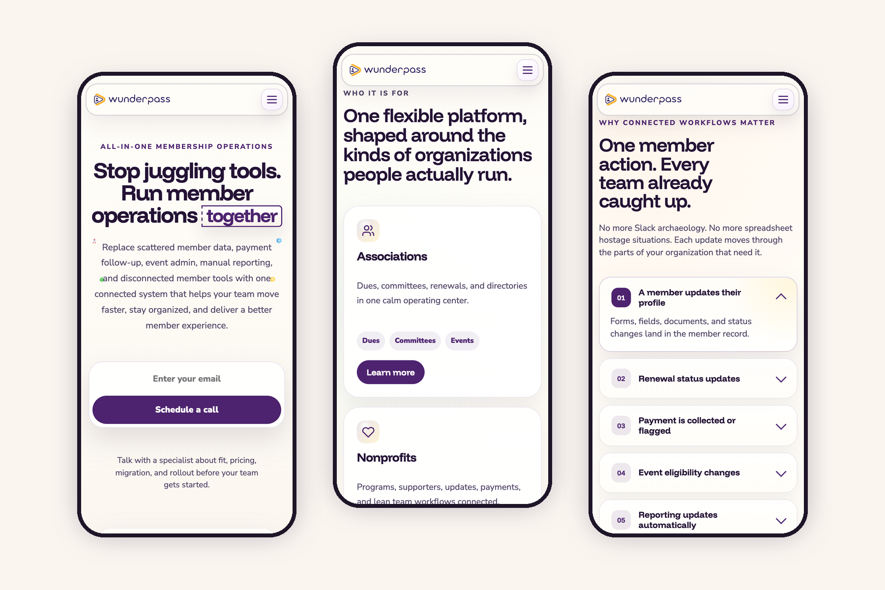
“Connected” is easy to say and hard to picture. We turned it into a short, interactive story: a member updates their profile, and the change ripples through renewals, payments, event eligibility, and reporting. The tone stays light, too. “No more Slack archaeology” lands the point better than a diagram ever could.
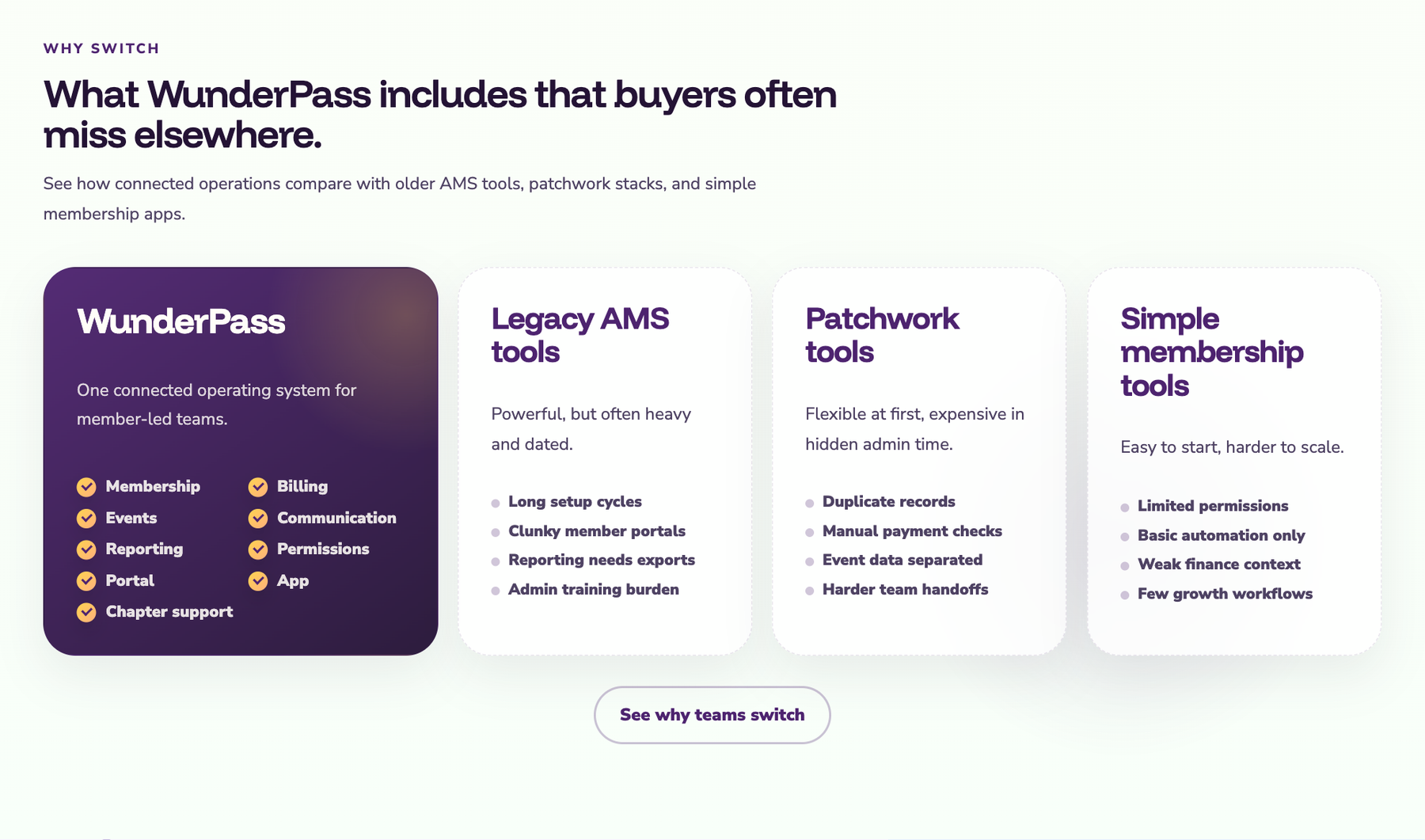
Honest comparisons for buyers who are already shopping.
Most visitors are replacing something. A clear comparison with legacy association software, patchwork tool stacks, and simple membership apps answers the question they are already asking, and the call to talk with a specialist sits at every natural stopping point.
Just as inviting on a phone.
Plenty of visitors arrive on their phones. Every section was designed to work at small sizes, with the same warmth, readable type, and a call to action that is always within thumb’s reach.
The website was half the story.
Alongside the marketing site, we redesigned the WunderPass platform itself, so the experience people are promised on the site is the one they get after signing in.