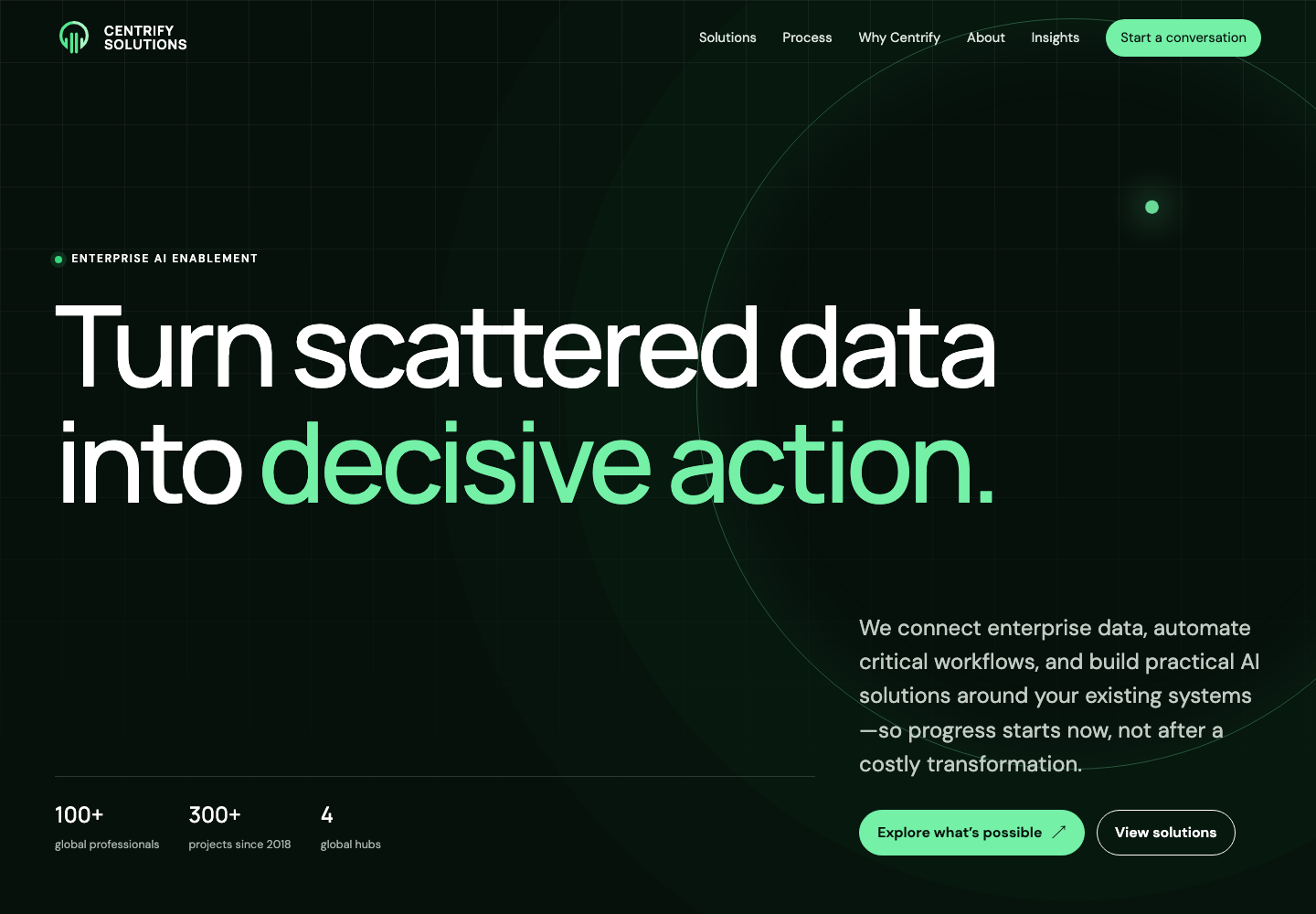
Solid services. A story that was hard to find.
Centrify had an experienced team and a broad enterprise offer spanning data integration, automation, analytics, security, and AI. But visitors had to cross several pages and read dense copy to understand how those capabilities connected.
The navigation was crowded, messaging shifted from page to page, and the visual language lacked consistency. The problem wasn’t missing content. It was order, hierarchy, and a clear path forward.
Lead with the problem clients recognize.
The new homepage opens with “Turn scattered data into decisive action”—a statement that names the pain and value before introducing enterprise terminology. From there, each section answers one question: What do you solve? How do the services connect? Why should we trust you? What happens next?
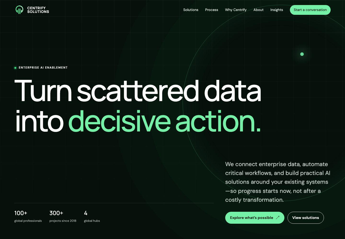
One set of rules for the whole experience.
Shared typography, spacing, cards, process steps, article patterns, and calls to action made the experience coherent and future updates easier.
Clearer writing
Core messages were rewritten around what clients need to understand, without adding claims the company couldn’t support.
Reusable components
A consistent component language now works across service, company, article, and legal pages.
Accessibility built in
Contrast, focus states, headings, labels, keyboard support, responsive behavior, and reduced motion were considered from the start.
A complete experience the team could test.
The working prototype was validated from 390px mobile to 1440px desktop. It achieved 100 Lighthouse scores for accessibility, best practices, and SEO, with no missing internal references or horizontal overflow in tested views. The design was approved for implementation in Centrify’s existing Wix platform.